Women Invest in Real Estate
Founded by Grace and Amelia, Women Invest in Real Estate (WIIRE) is a community of real estate investors dedicated to empowering women through education and support. Their mission is to help women feel confident and empowered to invest in real estate, fostering a community where like-minded women can share their wins, questions, and knowledge.


What we Did for WIIRE
WIIRE approached us with the goal of elevating their visual brand and website to reflect their expertise and experience in real estate investing. With an upcoming book publication with Bigger Pockets and an increase in the price of course offerings, they needed their brand and website to project a higher level of credibility and professionalism.
Below, we are visually expressing the overall creative direction that we have for the entire brand. The brand exudes a fun yet knowledgeable personality with a sprinkle of professionalism and formality. We aspire to bring the founders’ personalities forward - warm, inviting, and fun - and show that it is possible to enjoy life while making money.

Fonts and Colors
WIIRE has already been using a set of colors and fonts to create assets for online and offline. We had to standardize the use of these elements to promote a sense of cohesiveness throughout all the marketing materials that they release.
Using Color Story and Psychology
We applied color psychology to build a palette that visually represents WIIRE’s core values — balancing authority with approachability, wisdom with warmth, and sophistication with simplicity. Each hue was intentionally chosen to evoke specific emotions: trust and stability from the deep navy, friendliness and energy from the soft peach, and calm confidence from the lighter tones. Together, they create a color story that feels both professional and inviting.
Knowledge
Authority
Stability
Wisdom
Intelligence
Experience
Playful
Friendly
Youthful
Soothing
Refreshing
Youthful
Clean
Simple
Peaceful
Updating Their Typography
We used font psychology to select typefaces that best suit the brand. One of WIIRE’s main concerns was ensuring their fonts were available across all platforms, from social media to their website. To solve this, we shortlisted Google Fonts that align with their personality and maintain consistency everywhere their brand shows up.

DM Serif Display: Utilized for headers and titles, this serif font lends a professional and elegant feel to the brand. Its bold and chunky design ensures that important information stands out, while its sophisticated curves add a feminine touch.

Quicksand: The rounded edges of Quicksand add a playful and approachable vibe to the brand. This font balances the overall design, making it less formal and more inviting, which reflects WIIRE's authentic and relatable community.

Montserrat: A clean and modern sans-serif, Montserrat brings structure and clarity to the brand. Its geometric shapes and balanced spacing make it perfect for body text, ensuring readability across digital platforms.
Design of Visual Brand Identity
WIIRE’S brand stands for empowerment, especially when women investors interact with it. They hope to convey that real estate is a tool that does not discriminate in bringing freedom to explore passions and a fulfilled and happy life.


Website Design and Build
We revamped their entire Squarespace website, which is the perfect easy-to-manage platform that grows with them. In strategizing the entire build, we kept this in mind:
-
Ensure that the website is at the heart of their marketing efforts while serving as the front page of their entire ecosystem.
-
Centralize their authority-building content and streamline user experience by integrating all tools they use through embed codes and strategic links.
-
Design each page with conversion flow in mind, making it effortless for visitors to move from discovery to action.
-
Elevate their brand through cohesive, on-brand page designs that bring consistency across every touchpoint, from visuals and messaging to funnels and course pages.

Key Site Pages and Funnels
Every page on WIIRE’s website was designed with both form and function in mind. Beyond just looking cohesive, each page plays a specific role in moving visitors through the brand journey — from first discovery to enrollment. By combining intentional storytelling, clean design, and automation, the site now acts as WIIRE’s 24/7 marketing engine, working even when the team isn’t online.
-
![]()
Homepage
The homepage serves as a high-level narrative that introduces WIIRE’s mission and invites visitors to explore deeper. It sets the tone for the brand (professional yet approachable) and clearly guides users toward their next step (e.g., exploring valuable content, or listening to the podcast).
Thoughtful layout and design ensure that every section builds trust and curiosity, establishing WIIRE as a credible voice in women’s real estate investing.
-
![]()
About Page
The About page is all about emotional connection while positioning Grace and Amelia as industry leaders. It shares how WIIRE began, what drives the founders, and what the community stands for, highlighting both their personal wins and the growth of the movement.
The page closes with an invitation to collaborate, encouraging brands and partners to connect with the team. Heavy on storytelling and authenticity, it reinforces WIIRE’s clarity of message, genuine voice, and leadership in a traditionally male-dominated space.
-
![]()
Resources Page
The Resources page serves as a value hub for WIIRE’s audience. It features multiple opt-ins, from free guides to templates, all connected to automated thank-you pages and ConvertKit, which instantly sends an email to also deliver the downloads.
The page also houses carefully selected affiliate products and services that genuinely support the community’s investing journey. Each resource is designed to nurture relationships, build trust, and guide potential members toward WIIRE’s paid programs.
-
![]()
Podcast Page
With over 100 episodes, the Podcast page is both an educational resource and an authority builder. Episodes are fully embedded and searchable, allowing visitors to find topics that match their learning goals.
The page is a key contributor for SEO to boost discoverability and cross-platform engagement. It reinforces WIIRE’s expertise while keeping users engaged on the site longer.
-
![]()
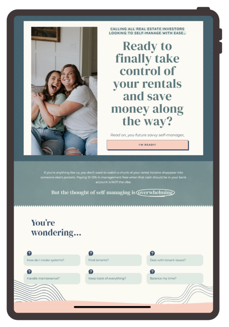
Courses & Sales Pages
Each course has its own dedicated, high-converting sales page designed to communicate transformation and build trust. These pages combine storytelling, testimonials, and clear calls-to-action to make enrollment seamless.
The goal was to let the pages sell for them, blending strategy, copy, and design to support their high-ticket offers. Together, these pages create a consistent funnel that drives predictable revenue and nurtures long-term growth.


-
![]()
Homepage
The homepage serves as a high-level narrative that introduces WIIRE’s mission and invites visitors to explore deeper. It sets the tone for the brand (professional yet approachable) and clearly guides users toward their next step (e.g., exploring valuable content, or listening to the podcast).
Thoughtful layout and design ensure that every section builds trust and curiosity, establishing WIIRE as a credible voice in women’s real estate investing.
-
![]()
About Page
The About page is all about emotional connection while positioning Grace and Amelia as industry leaders. It shares how WIIRE began, what drives the founders, and what the community stands for, highlighting both their personal wins and the growth of the movement.
The page closes with an invitation to collaborate, encouraging brands and partners to connect with the team. Heavy on storytelling and authenticity, it reinforces WIIRE’s clarity of message, genuine voice, and leadership in a traditionally male-dominated space.
-
![]()
Resources Page
The Resources page serves as a value hub for WIIRE’s audience. It features multiple opt-ins, from free guides to templates, all connected to automated thank-you pages and ConvertKit, which instantly sends an email to also deliver the downloads.
The page also houses carefully selected affiliate products and services that genuinely support the community’s investing journey. Each resource is designed to nurture relationships, build trust, and guide potential members toward WIIRE’s paid programs.
-
![]()
Podcast Page
With over 100 episodes, the Podcast page is both an educational resource and an authority builder. Episodes are fully embedded and searchable, allowing visitors to find topics that match their learning goals.
The page is a key contributor for SEO to boost discoverability and cross-platform engagement. It reinforces WIIRE’s expertise while keeping users engaged on the site longer.
-
![]()
Courses & Sales Pages
Each course has its own dedicated, high-converting sales page designed to communicate transformation and build trust. These pages combine storytelling, testimonials, and clear calls-to-action to make enrollment seamless.
The goal was to let the pages sell for them, blending strategy, copy, and design to support their high-ticket offers. Together, these pages create a consistent funnel that drives predictable revenue and nurtures long-term growth.
RESULTS
RESULTS
WIIRE now has a branded ecosystem that…
-
…aligns with their next chapter of growth - book launches, price elevation, and media visibility.
-
…represents their dual strengths: friendly relatability and industry-level authority.
-
…uses their Squarespace site as 24/7 selling machine that supports their programs and community.
-
…simplifies their backend operations with automated funnels and integrated email systems.